Let's get Charty!
People dig charts.
They can give quick looks at your data, and may even prove enlightening. I don’t really deal with charts too often anymore, but it comes up enough that I thought we could look at a couple of ways to get chart data using the ArcGIS API for JavaScript.
I figured for this quick demo I’d take this Smart Mapping demo. What makes this interesting is it uses Smart Mapping to update the renderer and the legend clientside. This is typically something you would do in Portal and save the results in your map, it’s not really efficient to be generating renderers on the fly, but hey, it’s fun!
For my charting adventures, I decided to use Chart.js because honestly it was pretty easy to use and some other libs had way too many options for my taste. Although those more advanced libs may suit you, I’m keeping it minimal man.
Enough fooling around.
Legend Charts
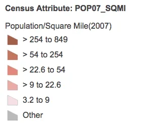
Legends can be cool, and they are informative. But what kind of context do they give you at a quick glance.
[caption id=“attachment_1238” align=“aligncenter”
width=“306”] Simple legend[/caption]
I could read the text of the legend and figure out what it’s telling me, but let’s imagine I’m lazy (I got stuff to do, I don’t have time to read).
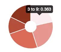
What if turned this legend into a chart?

That’s cool! I’m sure I could do some label stuff with Chart.js, but hey, now I can quickly see what values on my map are dominant in my map. It may not be much, but I think that’s pretty cool.
So what we’re doing here is building up the dataset that Chart.js can use. We’re going to use the renderer colors to color the chart, so it’s a little hacking to parse that data into a string per data object. Then to size the dataset, we’ll divide the maxValue by the minValue, this will give us a decent proportional size. I tried subtracting the min from max, but it lead to some pretty weak looking charts.
You can see this in action here.
Every time you update the data for Smart Mapping, it will update out little legend chart. Fun stuff right!
Statistics
Did you know the JSAPI comes with a little stats plugin or FeatureLayers? Yup, it’s called FeatureLayerStatistics and it’s used in the Smart Mapping modules to build out histograms and other cool stuff.
We’ll go ahead and play around with the getFieldStatistics method.
This is pretty simple. You get a handful of field stats back, but I’ll just show the average and sum on this chart. Note that including the white population in this chart kind of skews the scaling of the chart and as far as I can tell Chart.js doesn’t have a zoom method like Plot.ly does. If you take the White population out, the data makes for more readable charts. I’m sure you could run some normalization on this, but for demo, it’s cool.
Here is a working sample.
I had trouble getting the aspect-ratio and css to play nicely, but you get the idea.
There is so much you could do to create charts to your liking, it’s silly.
This is just a basic intro to using charts in your JSAPI apps, it is by no means extensive and doesn’t take into consideration some other cool stuff you could probably do by combining the REST API stats with the Geometry Engine to do some really cool stuff.
So try making some charts tied to your data in your apps and get that wow factor!